Thursday, March 22, 2018

Lab 3: Watersheds

Goals:

The goal of this lab is to learn and practice how to delineate watersheds. This involves filling in sink in the elevation model, determining flow direction, looking for stream channels, and setting a flow threshold to ID streams.

Methods:

The first step was data collection. A new file geodatabase was created and data was downloaded of the Adirondack Park boundaries as a shapefile. A hydrology shapefile was copied as well, which was provided by the instructor.

The next step was to process the data. The first step was to create a 20 km buffer around the park boundary. The hydrology shapefile was projected then to the same coordinate system as the park boundary shapefile, which was NAD 1983 UTM Zone 18N. The streams were then clipped to fit within the park boundary. A DEM of North America was added to the map and then transformed to the same coordinate system, and this was clipped as well but to the buffer around the park boundary. All data was then in the same coordinate system and the watersheds could be delineated.

Watershed delineation involves creating different datasets to input: flow directions, filled sinks, a source raster, water accumulation, and stream links. Flow direction was calculated first. This raster contains information about flow direction for each cell in the DEM. Figure 1 features this raster.

Figure 1. Flow direction is indicated by black and white values ranging from 1 to 255. 
Sinks were the next raster to be created. These must be filled or water flow is impeded. Figure 2 features the filled sinks.

Figure 2. Filled sinks. Elevations of sinks were raised to be the same as neighboring cells. If this does not happen the water will not flow properly. Sinks may be real or false. 
Another flow direction raster was created using the filled sinks raster. Figure 3 features this raster.

Figure 3. Flow directions with filled sinks. This looks similar to the DEM as water goes from high to low values.
The next steps was to find where water accumulates and channels are created. Stream channels can barely be made out, as shown in Figure 4.

Figure 4. It is very faint, but the black lines represent stream channels. 
A source raster was then created which serves as input for the watershed delineation. A threshold must be chosen that represents the minimum number of cells that flow into a cell, and this determines the size and number of watersheds that are ultimately delineated. 50,000 was chosen for the first try, and a conditional raster layer was created as shown in Figure 5 below.

Figure 5. The watershed with 50k as the conditional limit. 


Unique identifiers are assigned to each stream and thus stream links are created that look like channels. A vector streams file was created and watersheds could then be delineated. The results had to be clipped to the park boundary and the streams shapefile was added to compare watershed boundaries with the stream locations. This is shown in the results section below.

Results:

Figure 6. The watersheds in Adirondack Park. Note how the streams seem to follow the watershed delineation shapes. 96 watersheds were delineated using a DEM cell size of 60 m. 
Another map was created using a DEM size of 120m but it yielded few watersheds as the resolution was lower, which is shown in Figure 7. A map using 100k as the limit was created as well, but that had only 9 watersheds, and the map using 500k had 0. The higher the threshold the fewer the watersheds as fewer cells have that may flowing into them.

Figure 7. Watersheds using a DEM with cell size of 120m.


Sources:

ArcGIS Online. (n.d.). 30-arc-second DEM of North America [Map].

Cornell University Geospational Information Repository. (n.d.). [Hydrology shapefile]. Raw data.

New York State GIS Clearinghouse. (n.d.). [Adirondack Park Boundary shapefile]. Raw data.
http://gis.ny.gov
http://cugir.mannlib.cornell.edu/index.jsp

Lab 2: Georeferencing

Goals:

The goal of this lab is to understand how to georeference data that has no spatial reference information. Then new data can be created and used to solve spatial analysis problems.


Methods:

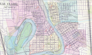
The first step of the lab was to add data that has spatial information attached, and is very accurate. In this case, it is a shapefile of transportation networks and roads of Eau Claire county. Then a basemap is added, and finally the non-georeferenced image was added. This image is shown below in Figure 1 and is from a 1878 historic map of Eau Claire.

Figure 1. A historic map of Eau Claire that has no spatial information attached. It will be georeferenced to make the map more accurate to modern day.

Then, using the georeferencing toolbar, control points were added. These control points connect a point on the historic map to a point on the shapefile for the transportation network, georeferencing points on the historic map. In this case, 15 control points were used. Control points where placed on features like street intersections or distinctive areas. Water features were not used as they can change between years. The idea is to have enough control points and have a low RMS error, meaning the true point and ungeoreferenced point are close enough. The map is shown in Figure 2 with control points added.

Figure 2. Note the red crosses with numbers, these are the control points. This image shows an already transformed raster.
A spline transformation was used to adjust the raster. Spline was chosen because it is a true rubbersheeting method and is focused more on local accuracy compared to global accuracy which works well with the small raster area.

Part two of the lab features creating data, specifically water features as polygons. A new feature class was created in a file geodatabase. The boundaries of Half Moon Lake, Chippewa River, and the Eau Claire River from the 1878 map were then digitized. An example of the digitized features is shown below in Figure 3.

Figure 3. Digitized polygons. These are the water features from the 1878 map overlayed on the current features. 
Then, to compare, the same water features were digitzed using the 2018 World Topographic Map boundaries.

Results:

Figure 4. The final georeferenced raster. Obviously, some features are not 100% spatially defined to what the map says, but the map is more spatially accurate. RMS error is under 1 as the spline transformation is used.  

Figure 5. Comparison of water features between the 1878 map, and the 2018 map. Obviously the main difference is that the features from 2018 are more spatially accurate, but they are also more detailed. The water features have sharply defined edges and seem more true to life, whereas the ones from 1878 seem more generalized.


Sources:

Eau Claire and Medford[Photograph found in David Rumsey Map Collection]. Retrieved from https://www.davidrumsey.com/luna/servlet/detail/RUMSEY~8~1~4181~480085# (Originally photographed 1878)

Eau Claire County. [Master_Centerlines feature class (clipped)]. Raw data.

ESRI. (2018). World Topographic Map [Map].

Sunday, February 4, 2018

Lab 1: Review of GIS I

Goals and Background:

The first lab was dedicated to a review of topics covered in GIS I. These topics include: ArcGIS, map features, layers, attribute tables, and editing symbology.

Methods:

The first goal was to become re-familiarized with ArcGIS, including ArcCatalog and ArcMap. ArcCatalog is similar to Window's File Explorer program, where you can view, preview, and edit files. The main difference is that ArcCatalog works primarily with file types used by ArcGIS such as .mxd, .gdb, and .shp. It is a powerful program as you cannot view these files in Windows Explorer. The difference is shown in Figure 1.

Figure 1. ArcCatalog on the left, and Windows Explorer on the right. The same folder is open in each program. Note how the programs view the same files differently. 
ArcMap was also part of the review. ArcMap is a program that has tools to create, manage, and edit geographic data. Data can be in the form of points, lines, or polygons. The program is shown in Figure 2 below.

Figure 2. ArcMap with a map open. There are points (donut shops), lines (streets), and polygons (land use). 
ArcMap features many tools, such as identify (a user clicks on a feature and information is displayed about the feature), and attribute tables. Attribute tables display records, which represent individual features. Attributes can be organized and queried, as well as created. Symbology is used to represent different features. In the case of the map in figure 2, symbology is used to represent the different land use types. Two maps were created using provide data, displayed in the results section below.

Results:

Map 1. Persons per square mile. 
 In Map 1 above, persons per square county is displayed. The data is normalized, meaning persons is divided by square mile giving population density. The map shows that population density is greater in the north western area of the map as there is a cluster of dark red areas. Perhaps here is where the larger cities lie.
Map 2. Median rent value. 
In the second map above, lower rent value is clustered generally in the north western portion of the map, however there are a few outliers (one notable in the north eastern portion). Higher rent values are then around those lower values, although a few are located in the middle of the lower values. This could correspond to a wealthier neighborhood, or suburbs of a city in the county. The median rent value does not directly match the pattern of persons per square mile, but someone could get a general idea of where population centers lie.

Sources:

Curtis, C., Dr. (n.d.). [Map data.]. Unpublished raw data.

Lab 3: Watersheds

Goals: The goal of this lab is to learn and practice how to delineate watersheds. This involves filling in sink in the elevation model, de...